The Visionary Behind Aava Supplements’ Award-Winning Packaging
Drawing Inspiration from Nordic Beauty
The concept of "Aava" immediately captured my imagination. It’s a Finnish word that evokes the vast, untouched beauty of the Nordic landscapes—open, pure, and free. My goal was to translate this feeling into every element of the design, so that customers could experience a little piece of that serenity every time they interacted with the product.
To achieve this, I kept the design simple and minimal. Clean lines, natural forms, and delicate botanical illustrations became the foundation of the visual identity. The illustrations were inspired by nature but modernized to align with today’s aesthetic preferences. Every detail, from typography to layout, was crafted to convey the purity and openness that Aava represents.
Balancing Purity and Practicality
When designing for Aavalabs Supplements, my aim was to highlight the natural wellness the products provide. I carefully selected botanical elements to represent vitality and balance, ensuring they worked harmoniously together without overwhelming the design.
Bold Pantone colors were key to giving each product its own identity while maintaining a cohesive look across the range. Pairing these vibrant colors with minimal white print allowed each product’s essence to shine while reinforcing the brand’s clean aesthetic. This approach not only created a visually stunning result but also offered flexibility for future product lines to integrate seamlessly.
Sustainability as a Core Principle
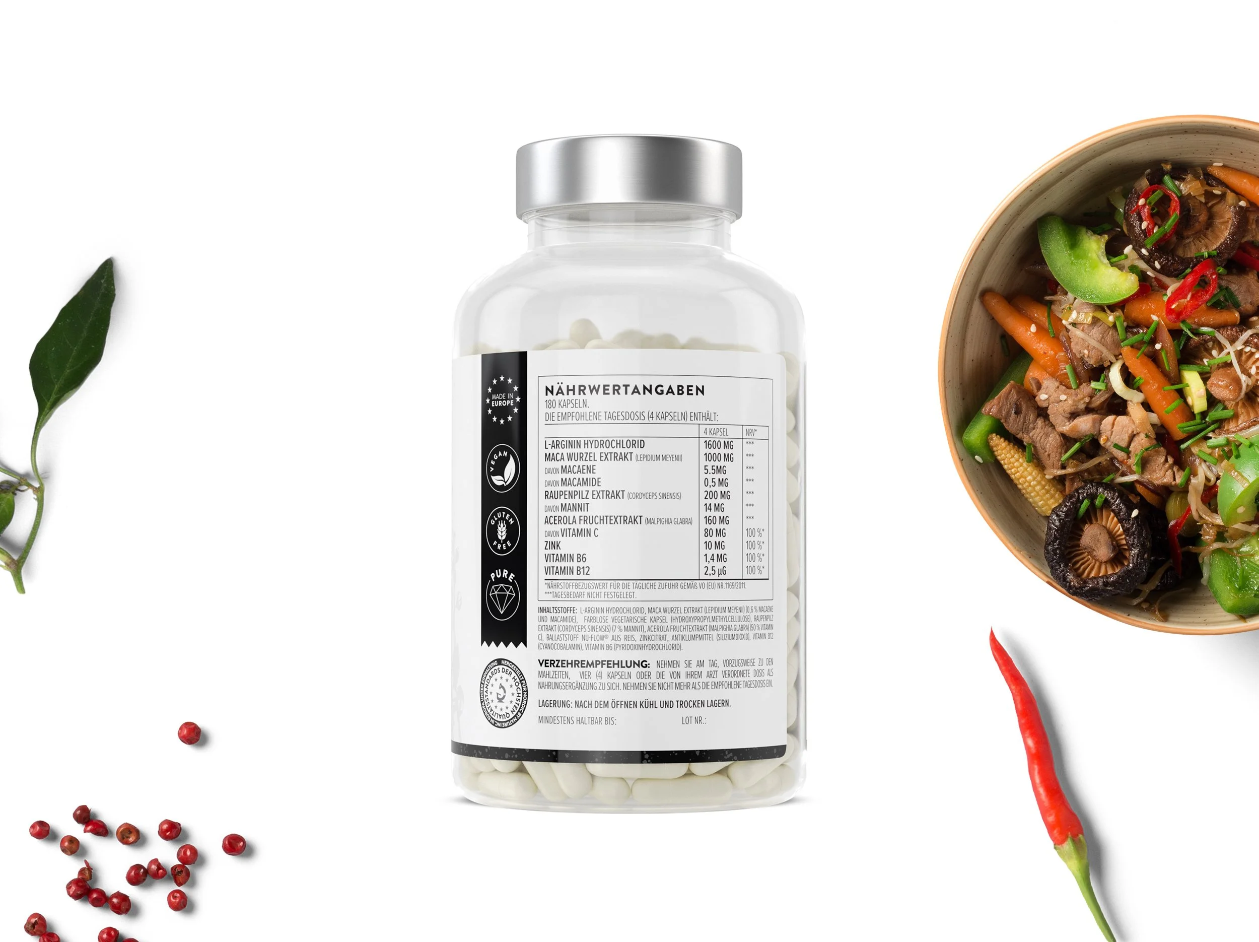
Sustainability was central to every decision I made throughout the design process. For the containers, I opted for transparent plastic because it’s highly recyclable and functional, allowing customers to see the product inside while reducing waste.
The outer boxes were printed on paper with a matte celloglaze finish, chosen for its soft, tactile feel that complements the brand’s natural ethos. I also avoided excess packaging, ensuring that every element served a purpose. It was important to me that the design reflected Aavalabs’ commitment to environmental responsibility, aligning with the growing demand for sustainable packaging solutions.
Designing for a Broad Audience
Aava Supplements is designed to appeal to a wide demographic, ranging from people in their 30s to their 60s. To create something that resonates with such a broad audience, I focused on timeless simplicity. The transparent containers provide clarity and trust, while the botanical illustrations add sophistication and a connection to nature.
I wanted the design to feel approachable and authentic—qualities that speak to both seasoned wellness enthusiasts and those just beginning their health journeys.
Creating Visual Identities Through Color
The use of unique Pantone colors for each product was one of the most exciting parts of the project. I wanted these colors to visually communicate the properties of each supplement. For example, calming supplements have soft, soothing tones, while energy-boosting formulas feature vibrant, uplifting hues.
This strategy not only helps customers easily identify the right product but also reinforces the natural and functional aspects of the brand. It’s a balance of intuition and aesthetics that ensures the design is as practical as it is beautiful.
Navigating a Tight Timeline
Completing the project in just one month was a challenge that required focus and efficiency. From the beginning, I prioritized key elements like clean lines, botanical illustrations, and transparency. Staying aligned with Aavalabs’ goals and values helped streamline the process and minimize revisions, ensuring we delivered a design that felt thoughtful and timeless within the tight deadline.
The Role of Sensory Design
I’ve always believed that great design should engage more than just the eyes. That’s why the tactile experience of the packaging was so important to me. The matte celloglaze finish was chosen to create a refined, premium feel while reducing glare, allowing the colors and illustrations to shine.
By combining visual and sensory elements, I aimed to create an immersive experience that connects customers to the brand’s natural purity and sophistication.
Looking to the Future
As trends in packaging design continue to evolve, I see exciting opportunities for Aava Supplements to embrace even more sustainable solutions, like biodegradable materials, without losing its Nordic roots. It’s about balancing tradition with innovation and staying true to the brand’s core values of purity, simplicity, and connection to nature.
Conclusion
Designing the packaging for Aava Supplements has been one of the most rewarding projects of my career. It’s a testament to how thoughtful design can blend art, function, and sustainability to tell a brand’s story. My goal was to create something that not only stands out but also feels authentic and timeless—and I’m proud to see how the design resonates with consumers and industry professionals alike.


